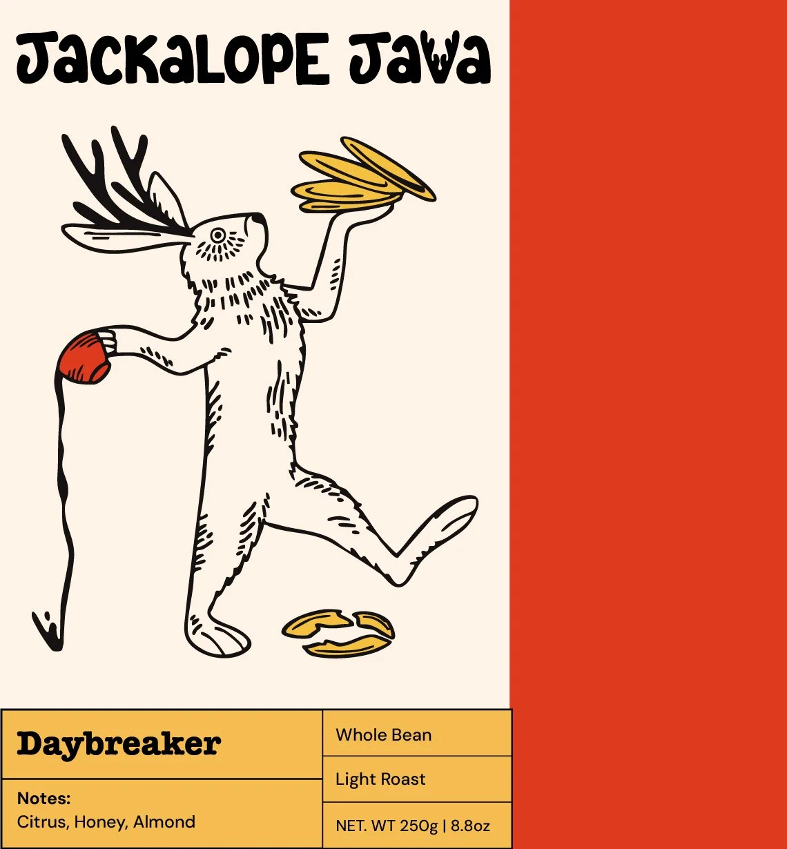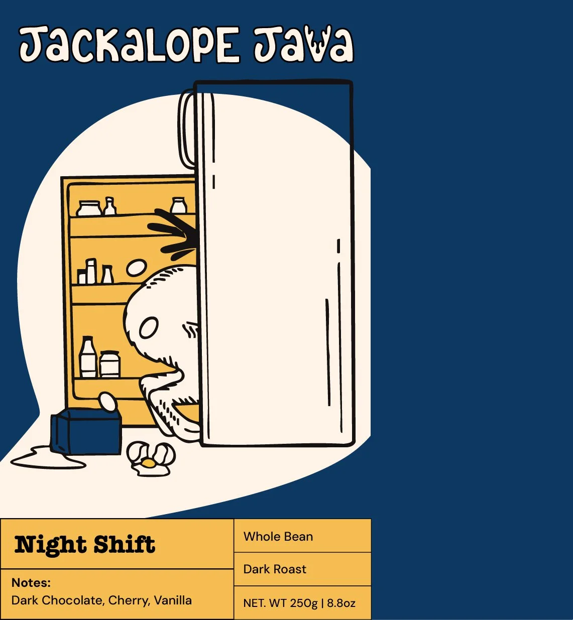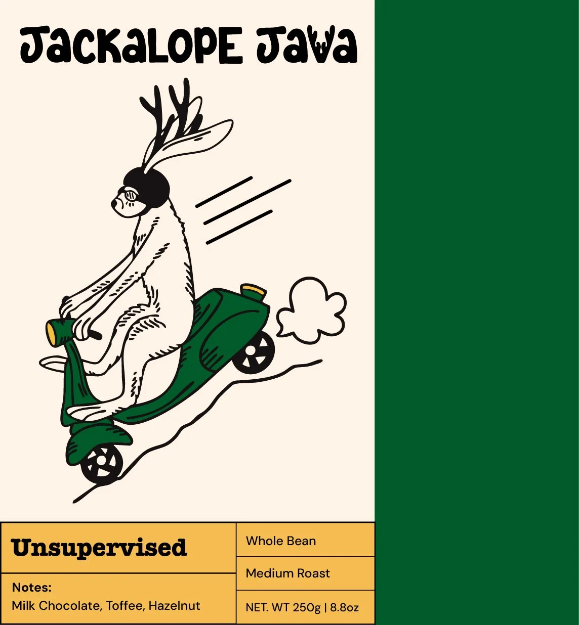
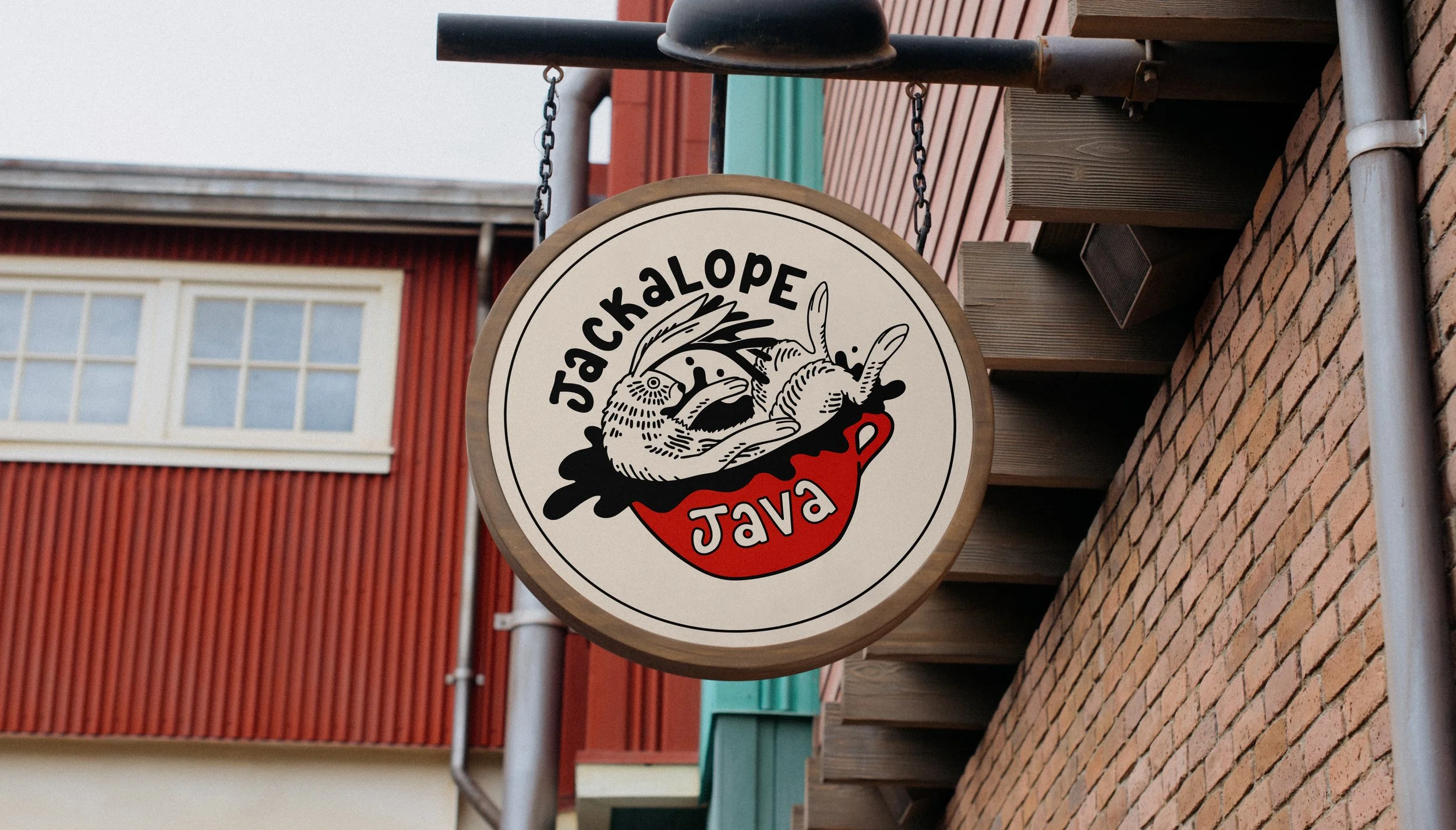
For this personal project, I created a coffee brand concept inspired by the folklore surrounding jackalopes. I’ve always been drawn to stories of strange creatures, so I set out to build a bold, vibrant brand centered around a mischievous jackalope mascot. I wanted to create a brand identity that celebrates curiosity and a little bit of chaos, inviting people to embrace playfulness and question the ordinary.
Jackalope Java reimagines cryptid folklore through a playful, contemporary lens, moving away from the darker, outdoors-oriented aesthetics often associated with cryptids in favor of bold color, humor, and visual storytelling.
The target audience is open-minded, curious, and creative individuals who find joy in the unusual. They embrace their own sense of strangeness and connect with art, storytelling, and the outdoors. This is coffee for those who chase inspiration, welcome unpredictability, and don’t mind stirring up a little trouble.
Jackalope Java Brand Concept
Procreate, Adobe Illustrator, Adobe Photoshop
Materials Used
Designer
Project Type
Coffee Brand
Role
Year
2026
Design Process
I started by sketching jackalopes in a variety of poses. Over time, I developed a more anthropomorphic, playful direction for the character and began ideating the mascot’s personality. Rather than portraying the jackalope as a mysterious cryptid, I developed it as a mischievous mascot whose personality could drive storytelling across the brand system.
Logo Sketches
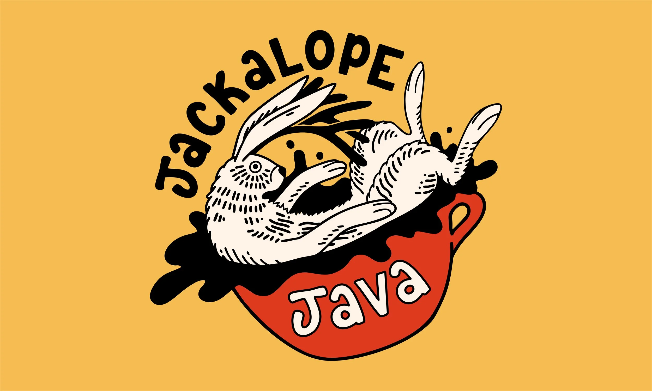
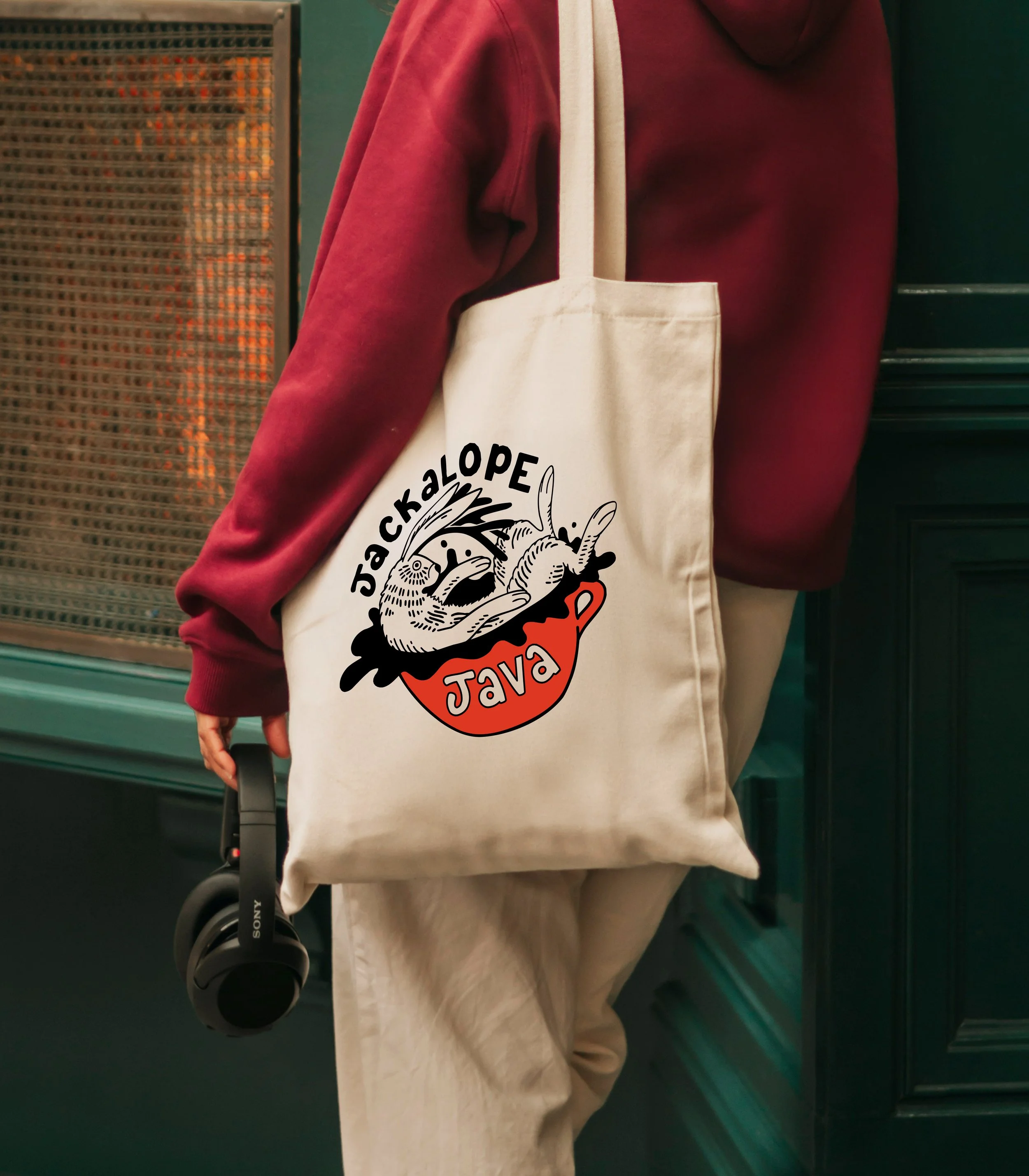
I explored multiple logo iterations and type directions centered around a jackalope sitting in a coffee cup. While the concept had potential, I felt it lacked movement. To address this, I redesigned the logomark to show the jackalope jumping into the coffee, introducing more energy and personality. I also developed custom hand-lettering to give the wordmark a more organic, playful feel.
Logo Development
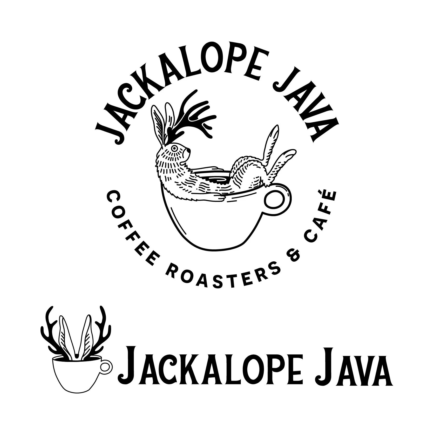
Early direction:
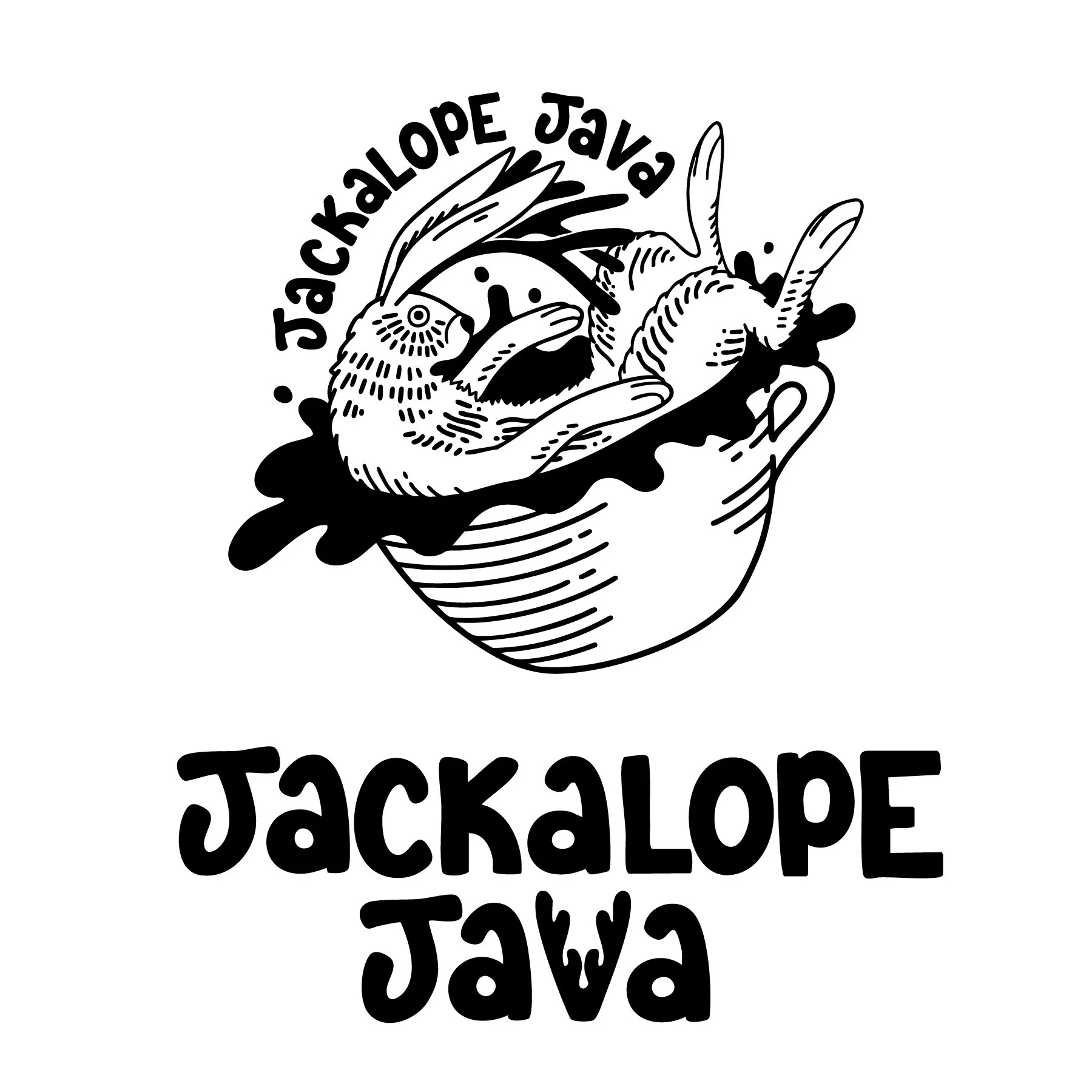
Middle refinement:
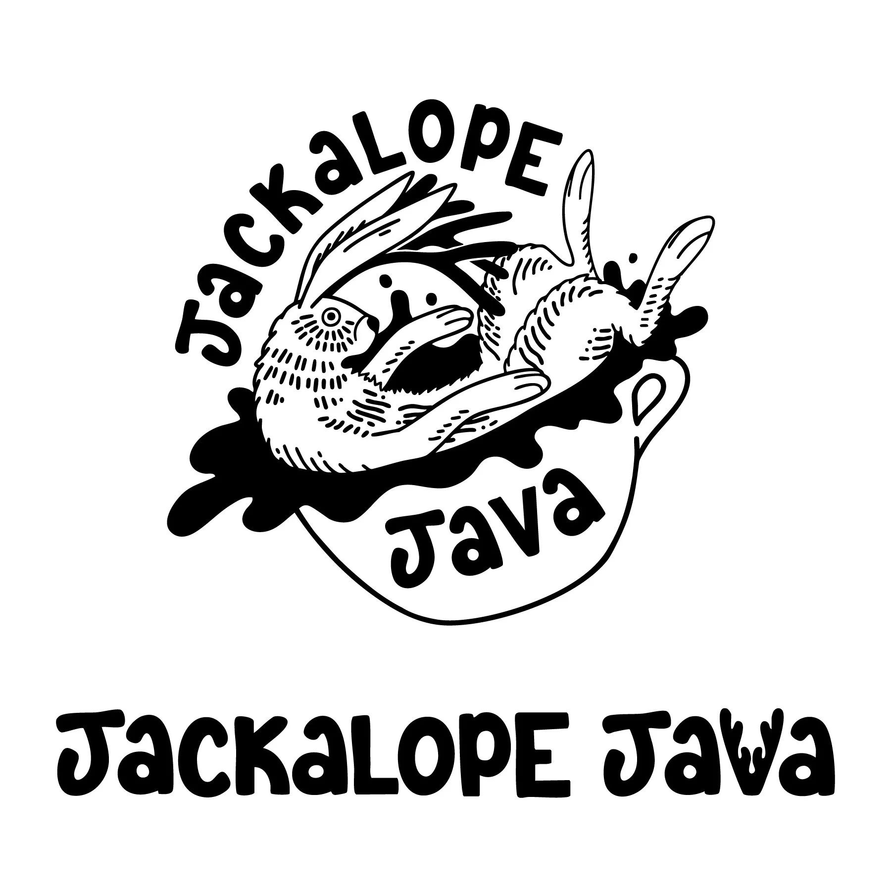
Final design:
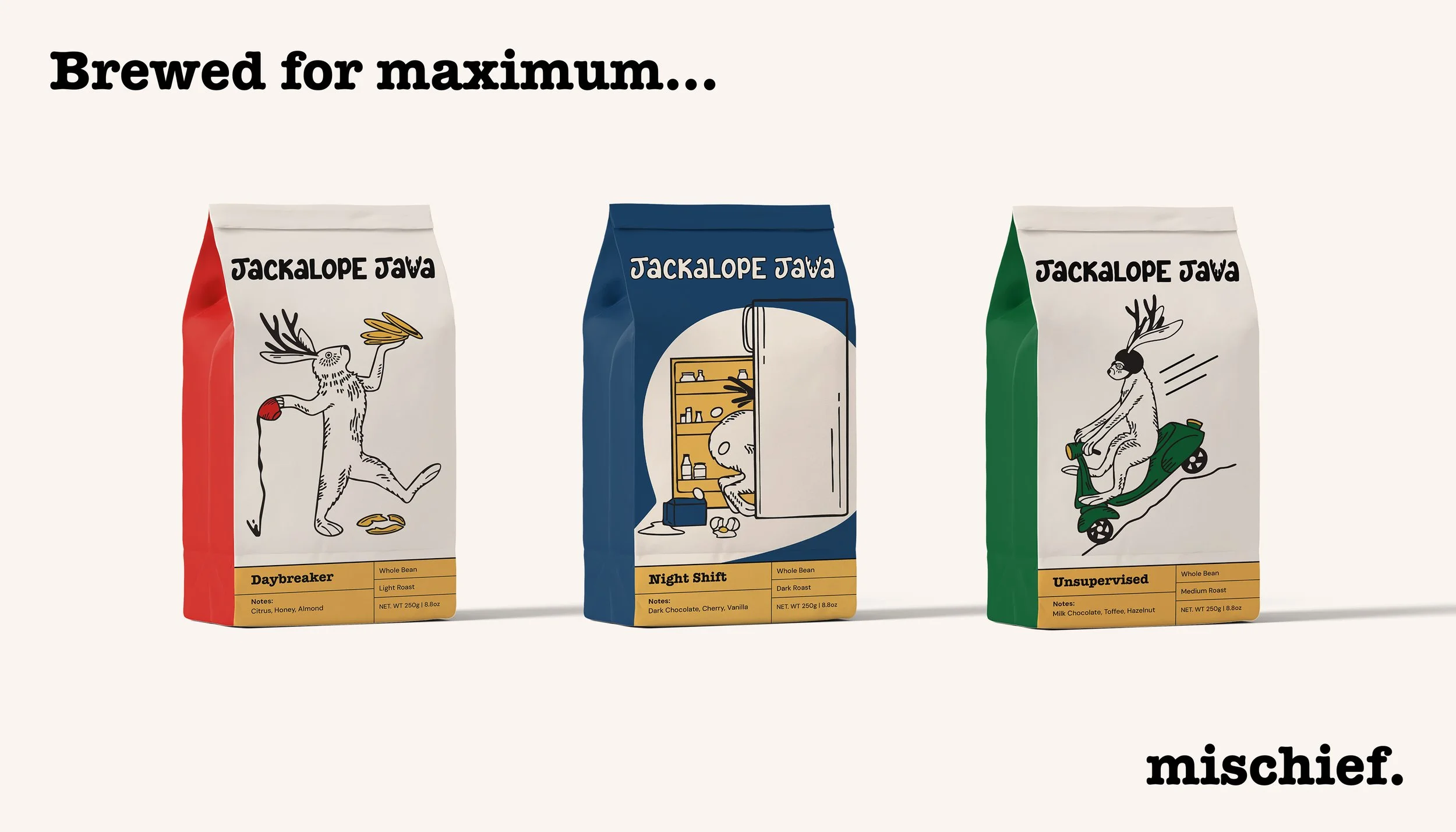
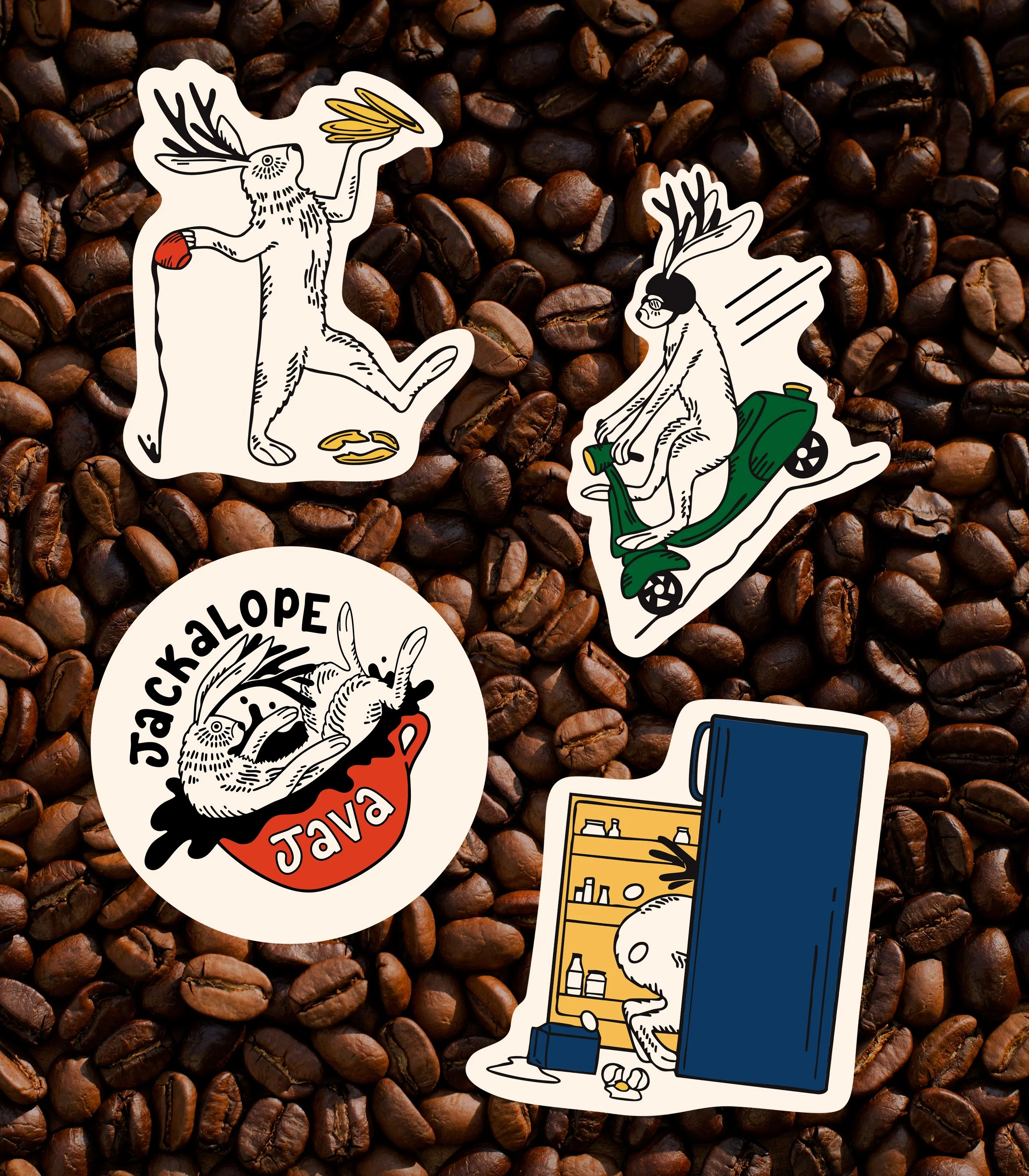
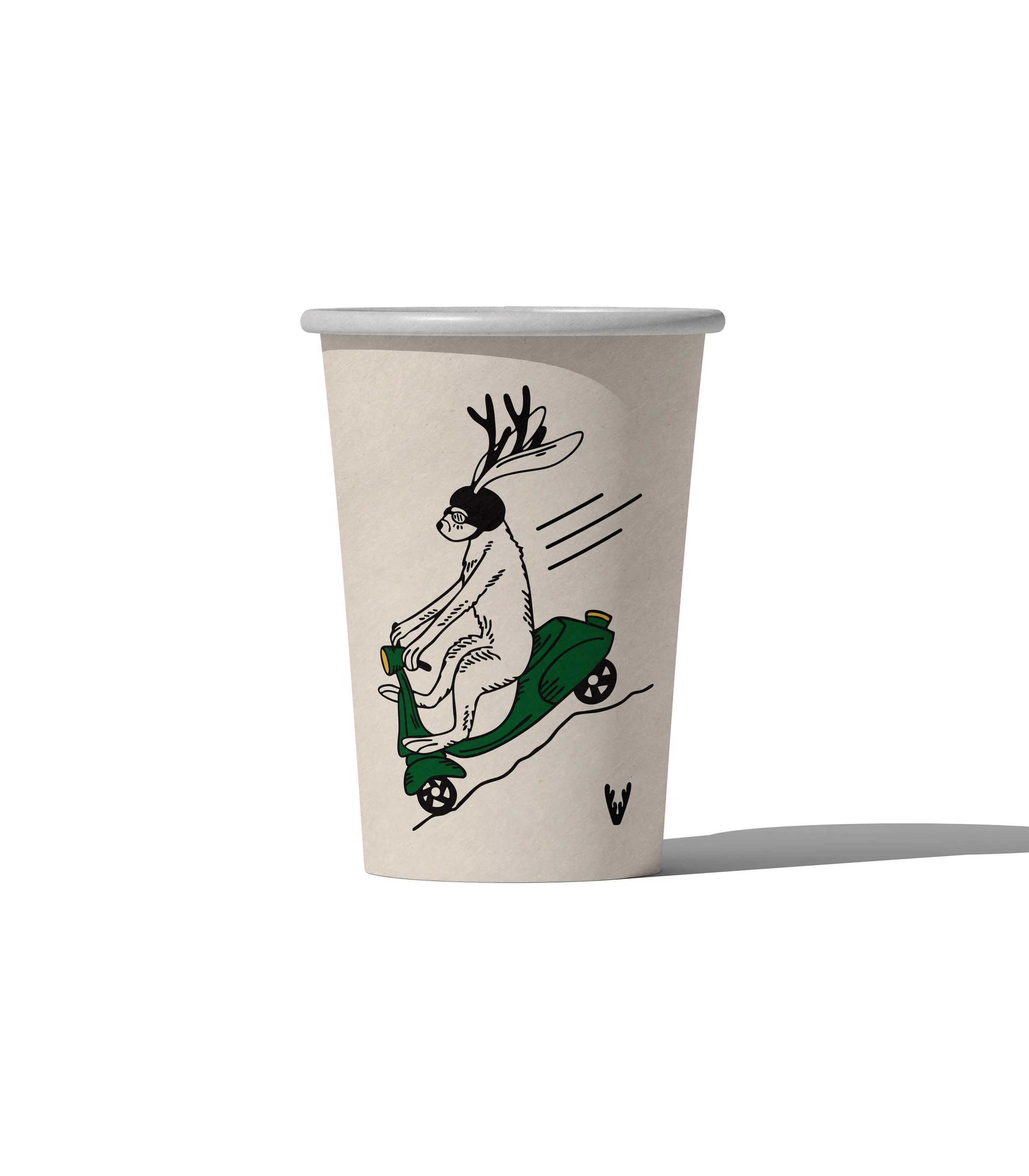
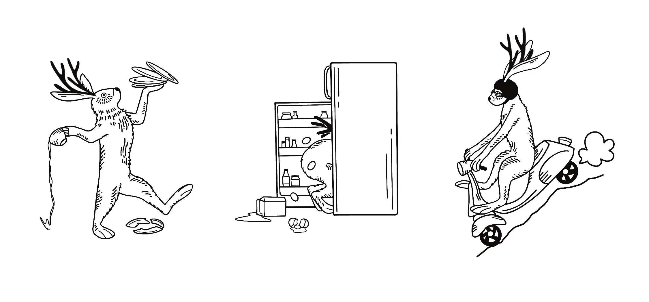
After finalizing the logo, I began sketching scenarios the jackalope might get into, exploring how the mascot’s mischievous personality could carry across the packaging system.
Packaging Exploration
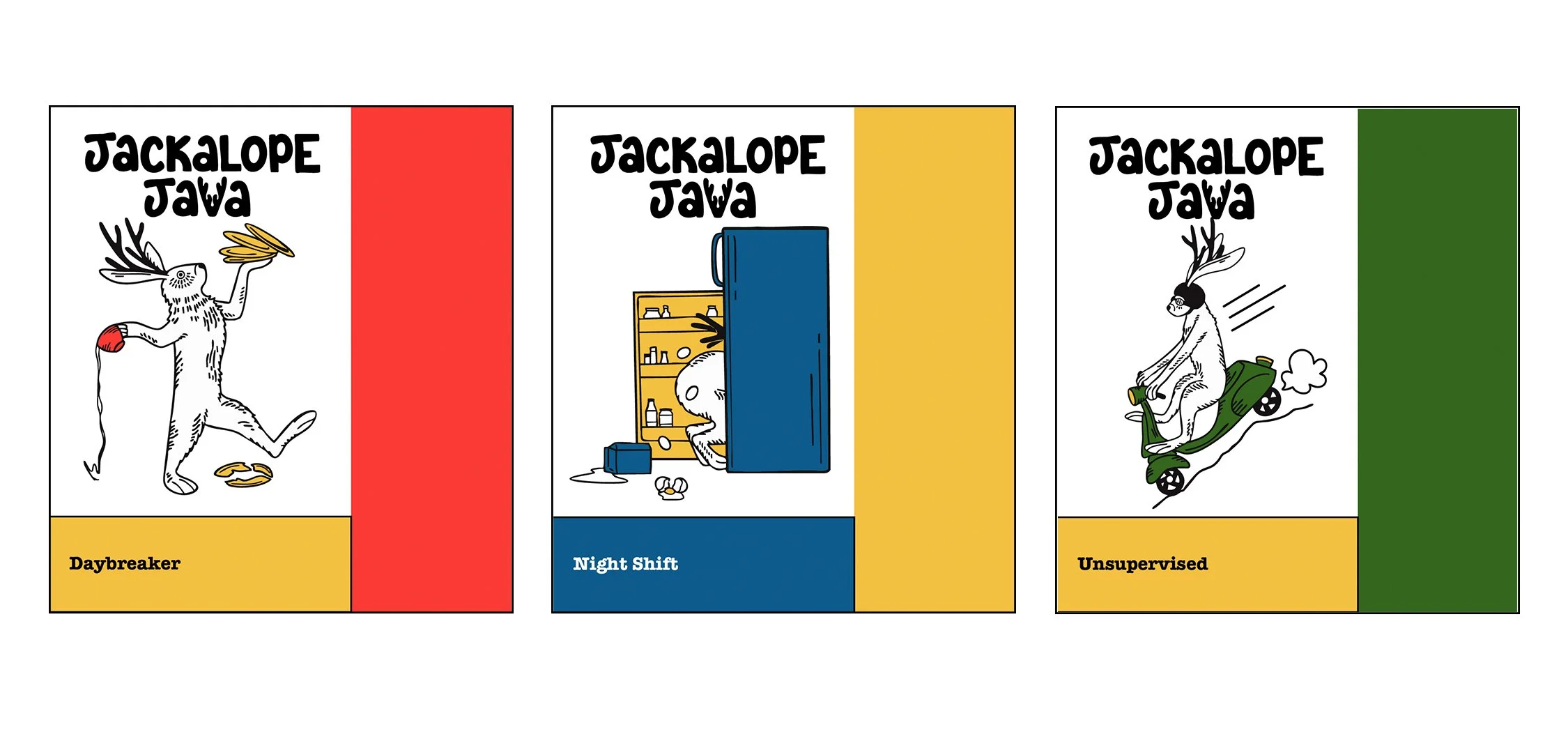
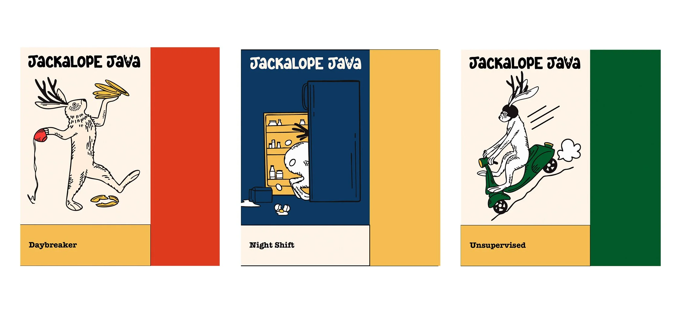
As the packaging system developed, I shifted from a brighter primary palette toward richer, slightly aged tones. This helped connect the brand visually to folklore and a sense of history, while the bold color contrasts kept the identity feeling playful, vibrant, and modern.
Color & Visual Direction
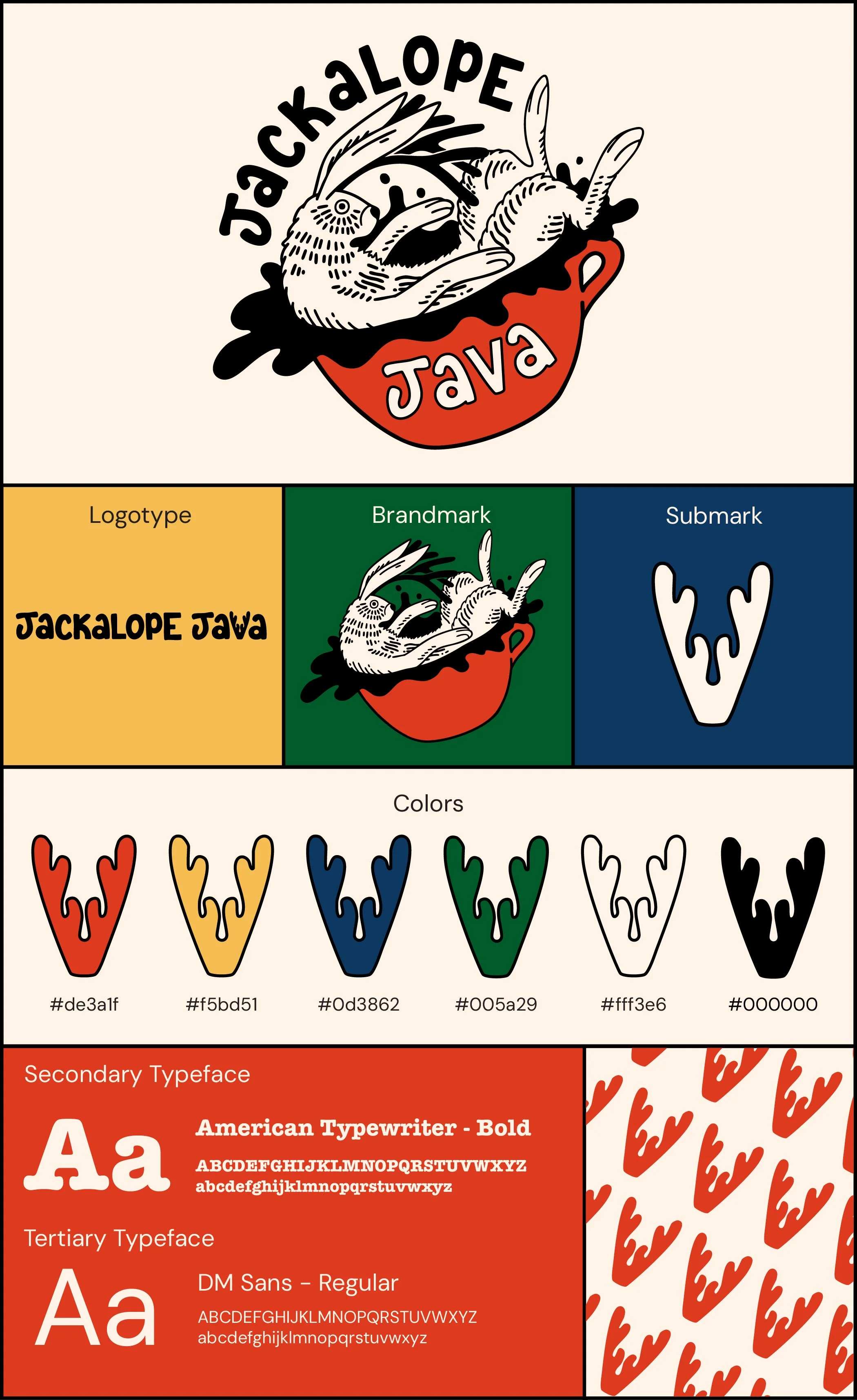
Final Brand System & Packaging